IT Security, Data Visualization, Design Systems
Smart Tabs: A Heads-Up Display That Rebuilt Analyst Trust at OpSec
A customizable heads-up display for OpSec's brand-protection platform: several marketplace views open at once, live scan status on every tab, a high-contrast scan scheduling grid, and accessible light and dark themes.
OpSec Security
- 01 Problem
Exit interviews showed customers losing confidence in the platform. Latency hid what the system was doing, and analysts could only see one view at a time.
- 02 Approach
A tab system designed as a component, with anatomy, states, grouping and sizes, plus a redesigned scan scheduling grid and row themes checked against AA and AAA contrast.
- 03 Outcome
Analysts could watch several marketplaces at once while scans ran, turning hidden system work into visible proof that it was working. Trust became a tracked success metric.
Brands protected on the platform











Interactive prototype
Open full screen in Figma ↗Click the tabs and controls to move through the prototype, or open it full screen in Figma.
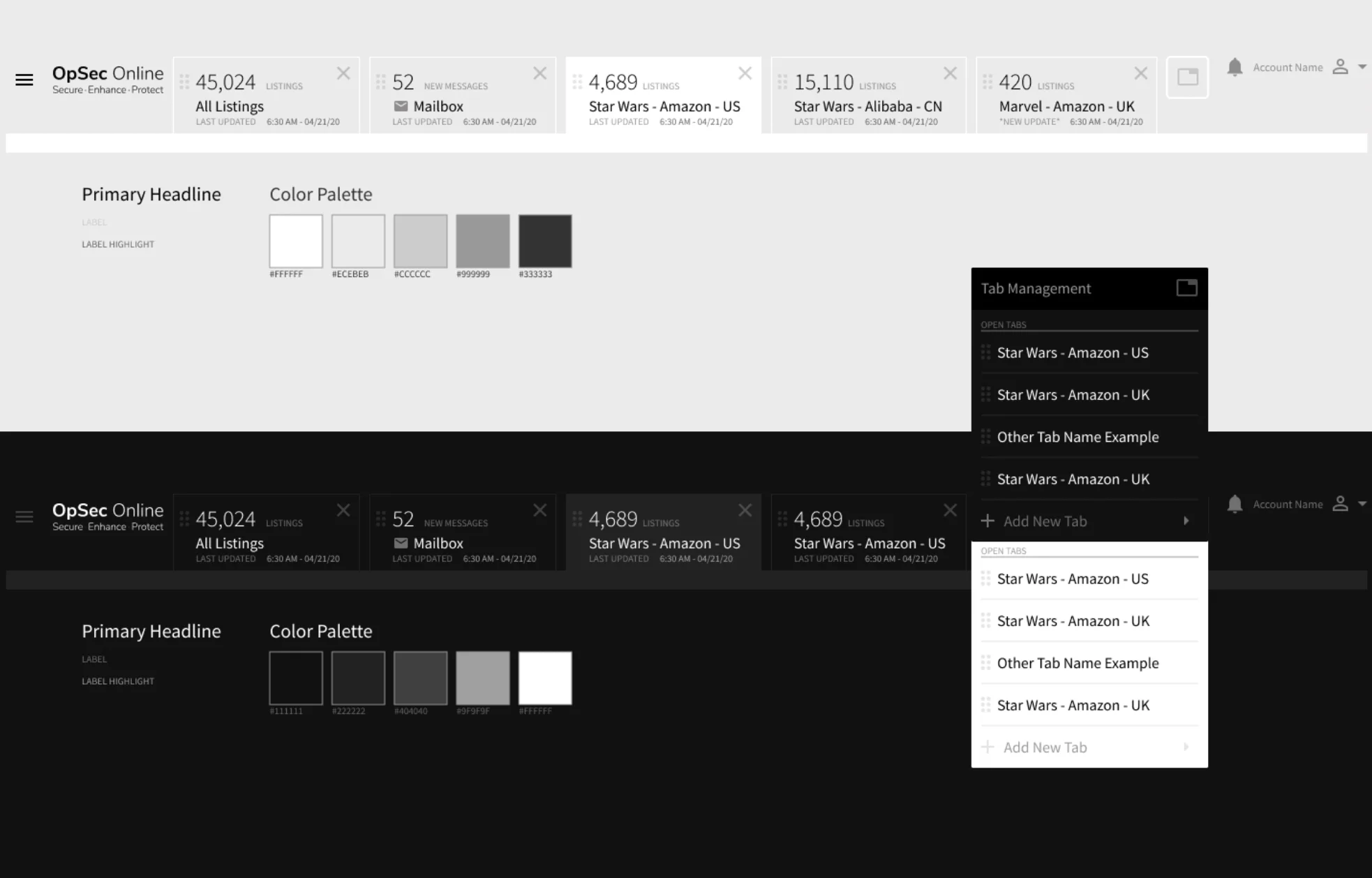
The tab system
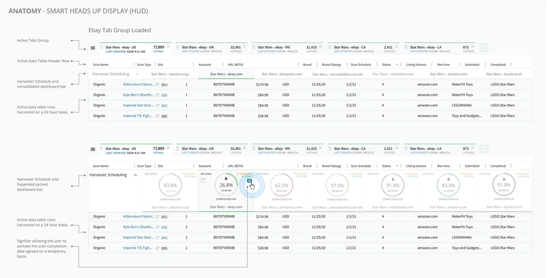
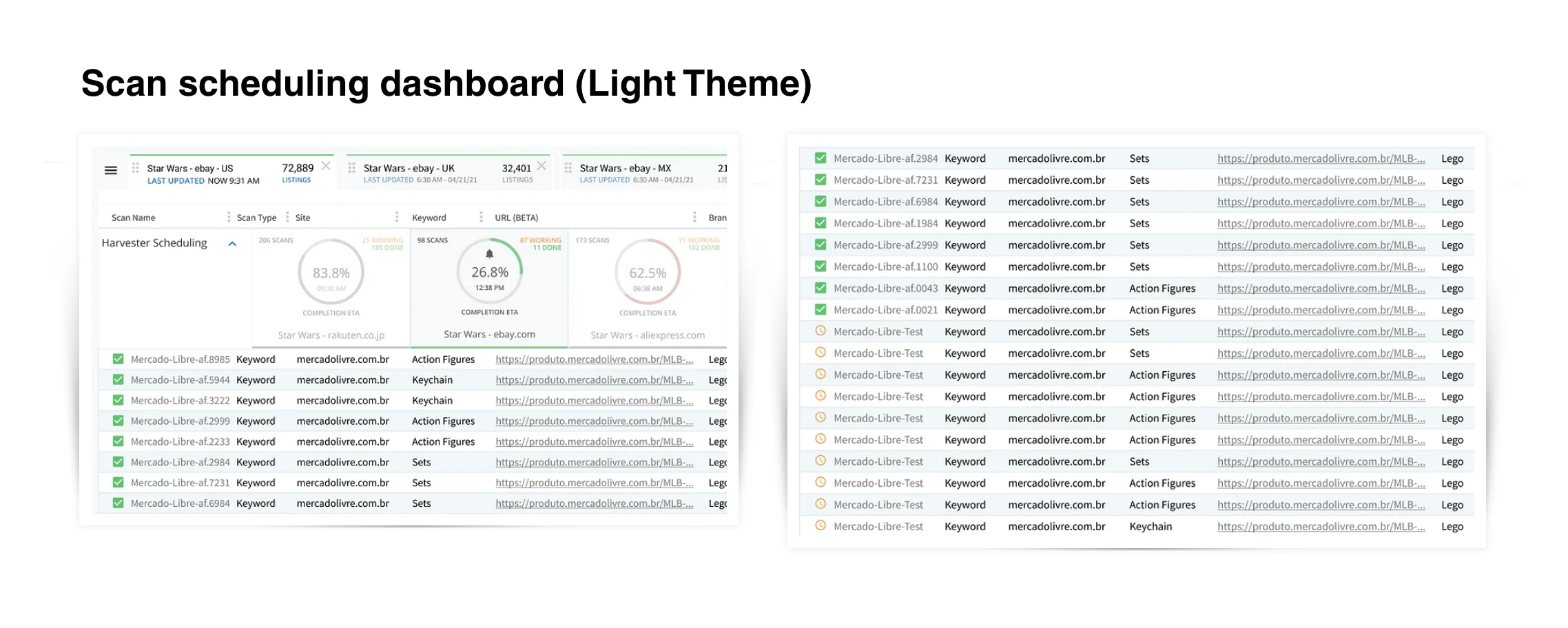
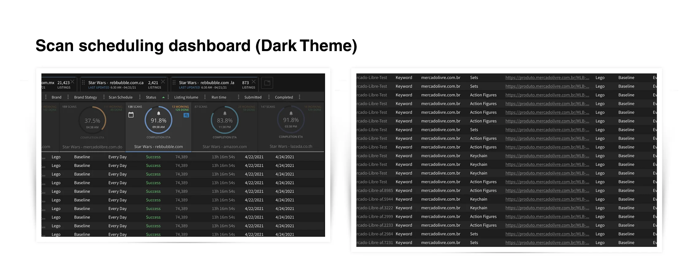
Harvester scan scheduling
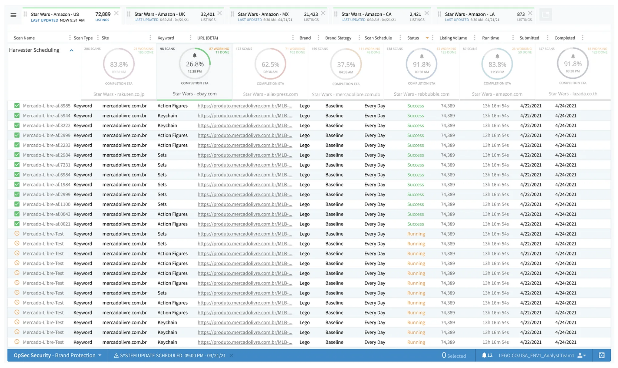
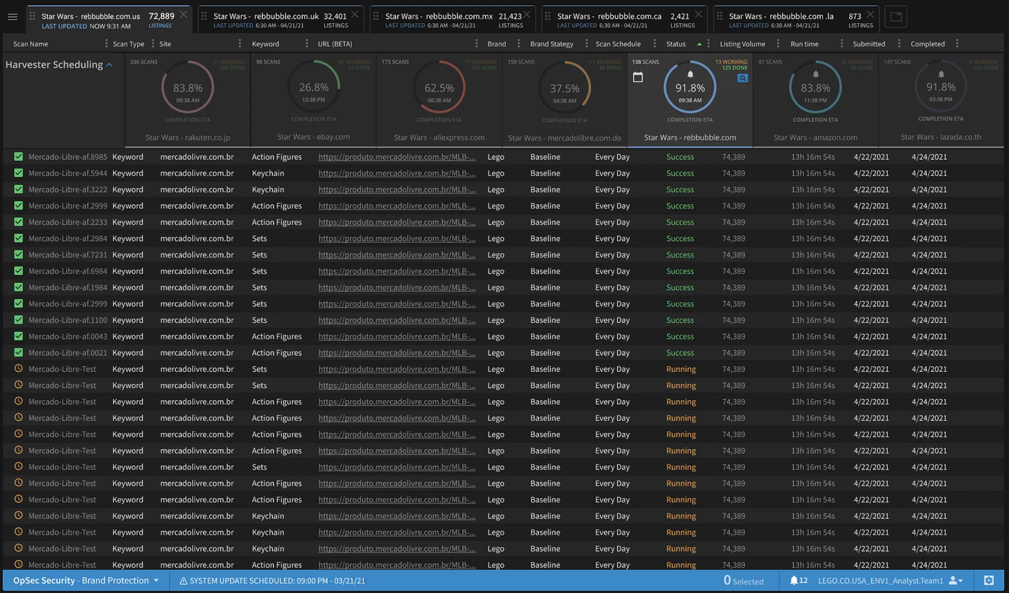
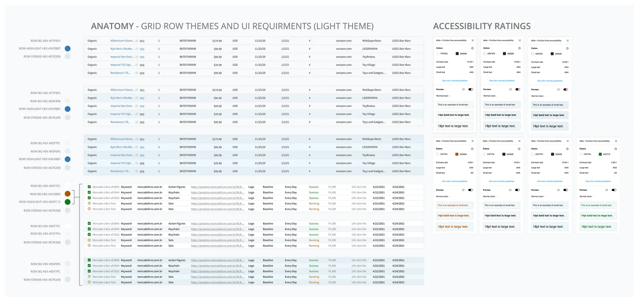
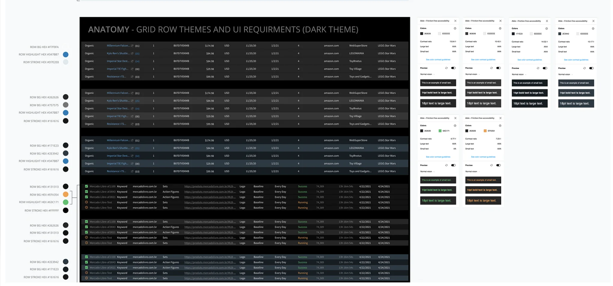
Accessible grid themes
Concept: verifiable origin
OpSec's platform helps brands find and remove counterfeit and infringing listings on marketplaces like Amazon and Taobao. Exit interviews told a hard story: customers were losing confidence in it. Scans ran slowly behind the scenes, and analysts could only look at one view at a time, so the system felt slow and opaque even when it was working. Trust became a success metric for the redesign.
The problem
Latency was not something design could remove, but it could be made visible. Analysts worked across many marketplaces and brands at once, yet the interface made them leave one view to check another. Customer service managers had the same blind spot when clients asked what was happening with their scans.
A heads-up display built from tabs
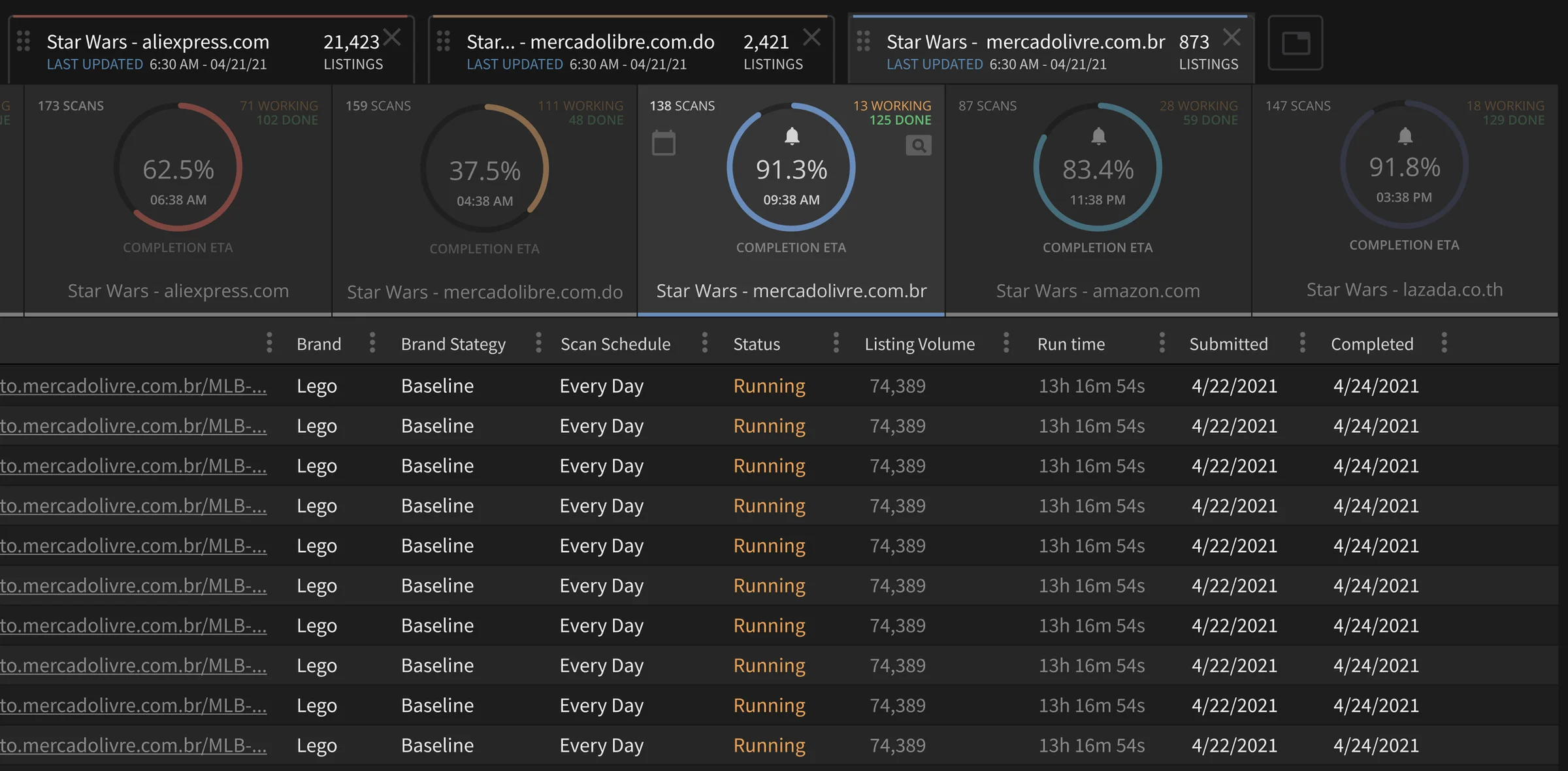
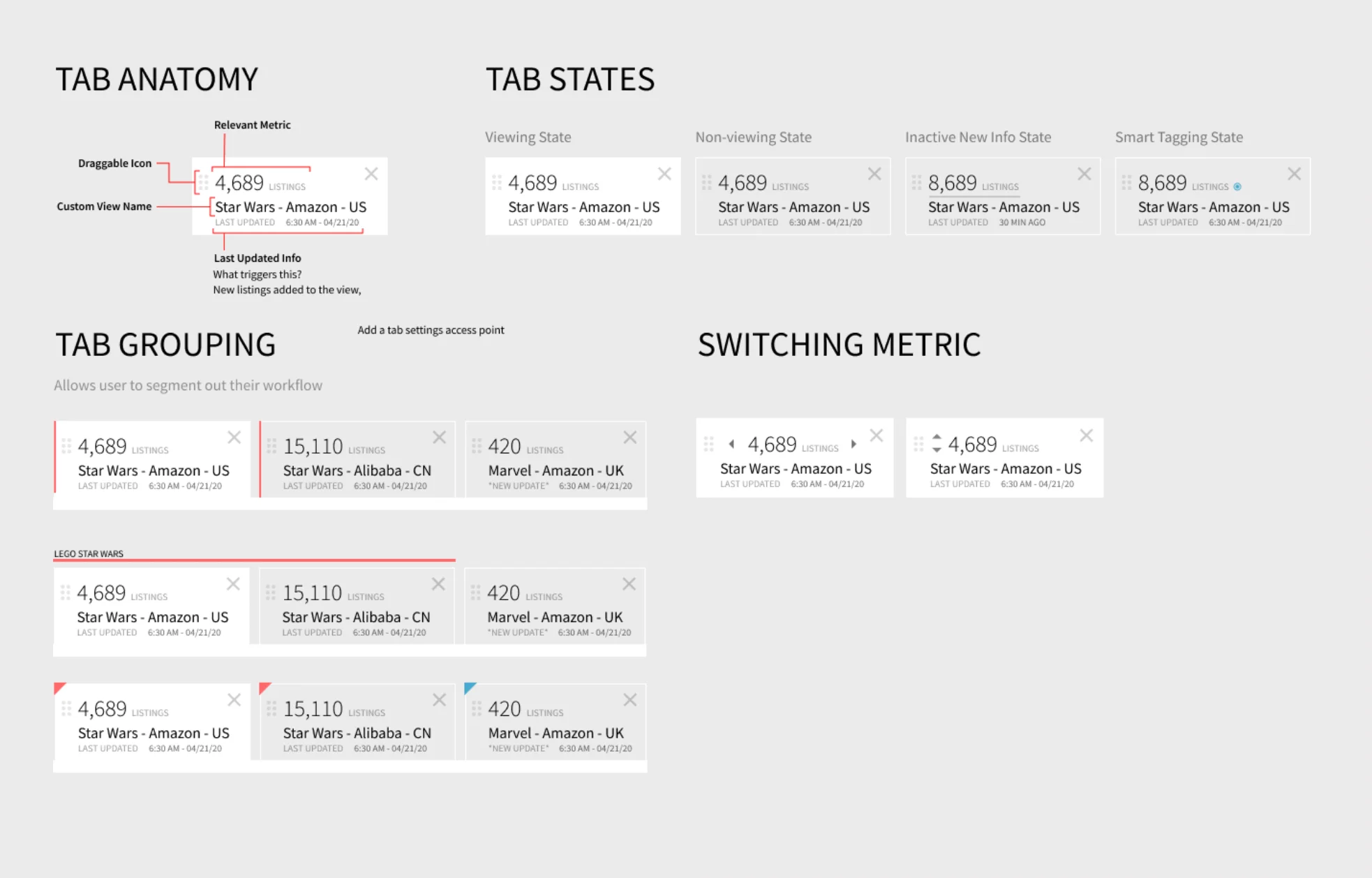
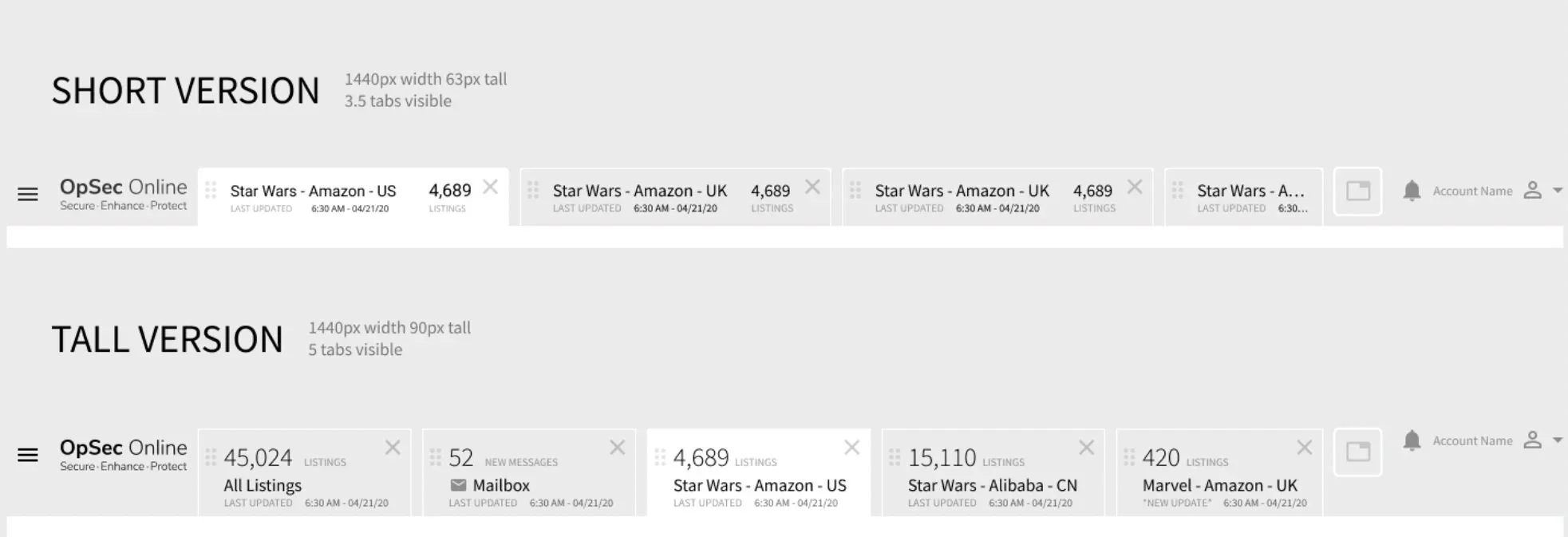
Smart Tabs puts several custom views on screen at once. Each tab carries its own listing count, view name and last-updated time, so an analyst can keep working in one marketplace while scans finish in others. The tab was designed as a component, with a clear anatomy, four states (viewing, not viewing, new information, and Smart Tagging), grouping by color or label so analysts can segment their workflow, and short and tall versions of the bar. Analysts and managers can add collapsible dashboards and bars to fit how they work.
Scan scheduling that stands apart
Every grid on the platform looked the same, which made it easy to lose your place. The new harvester scan scheduling view gives scans their own high-contrast layout, with completion dials across the top and clear status colors in the grid, so it reads differently from the listings grids around it.
Accessible by default
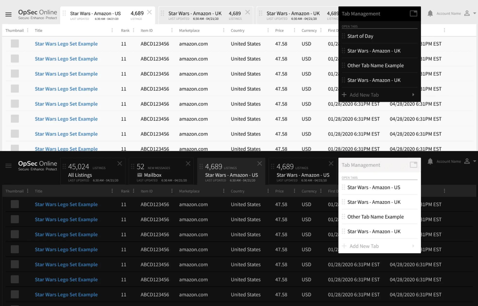
Dense data tables are hard to read. Row backgrounds, highlights and strokes were defined as themes for light and dark modes, and every color pair was checked with a Figma accessibility plugin against AA and AAA contrast standards.
Concept: verifiable origin
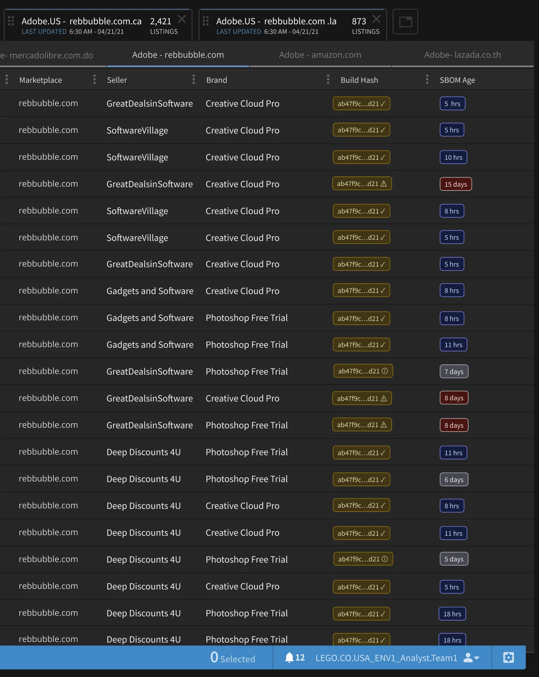
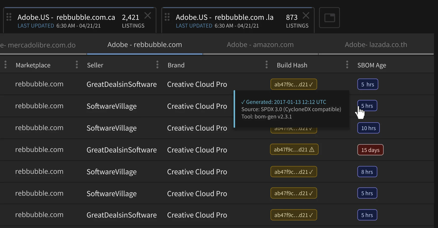
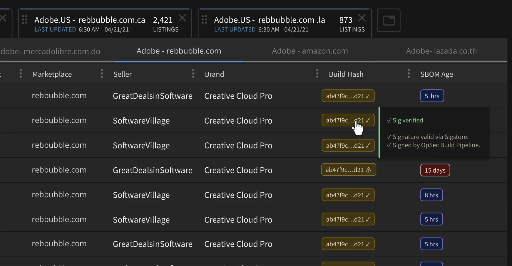
A later concept extends the same HUD to software brand protection, for clients like Adobe. Tabs would carry verified build hashes and SBOM age inline, so an enforcement analyst can see that a scanner or classifier ran on a known, untampered build. That turns a similarity score into evidence a legal team can defend, and it supports cleaner takedowns:
- Defensible takedowns: each flagged listing links to an attested build, a clean chain of custody.
- Less noise: views aware of vulnerability status hide non-issues, so analysts stay on real infringement.
- Smoother approvals: clear provenance reduces security objections in procurement and cross-border enforcement.
See how Smart Tabs fits the wider platform in the OpSec case study.
Skills: Product Strategy, UX Design, UX Research, Quantitative Analysis, Design Systems, Product Ownership.