Accessibility Lens
What if anyone could see this site the way a visitor with low vision, color blindness or a hand tremor does?
Try it
Choose a simulation. It applies to this whole site until you turn it off, so you can browse any case study through it. Press A anytime to bring the panel back.
Your case studies under the Lens
Real screens from OTIS 2.0, my redesign of the Ohio State Highway Patrol's citation software. Choose Cataracts, Blurred vision or Roadside above and compare the legacy form with the redesign built for the troopers who use it.
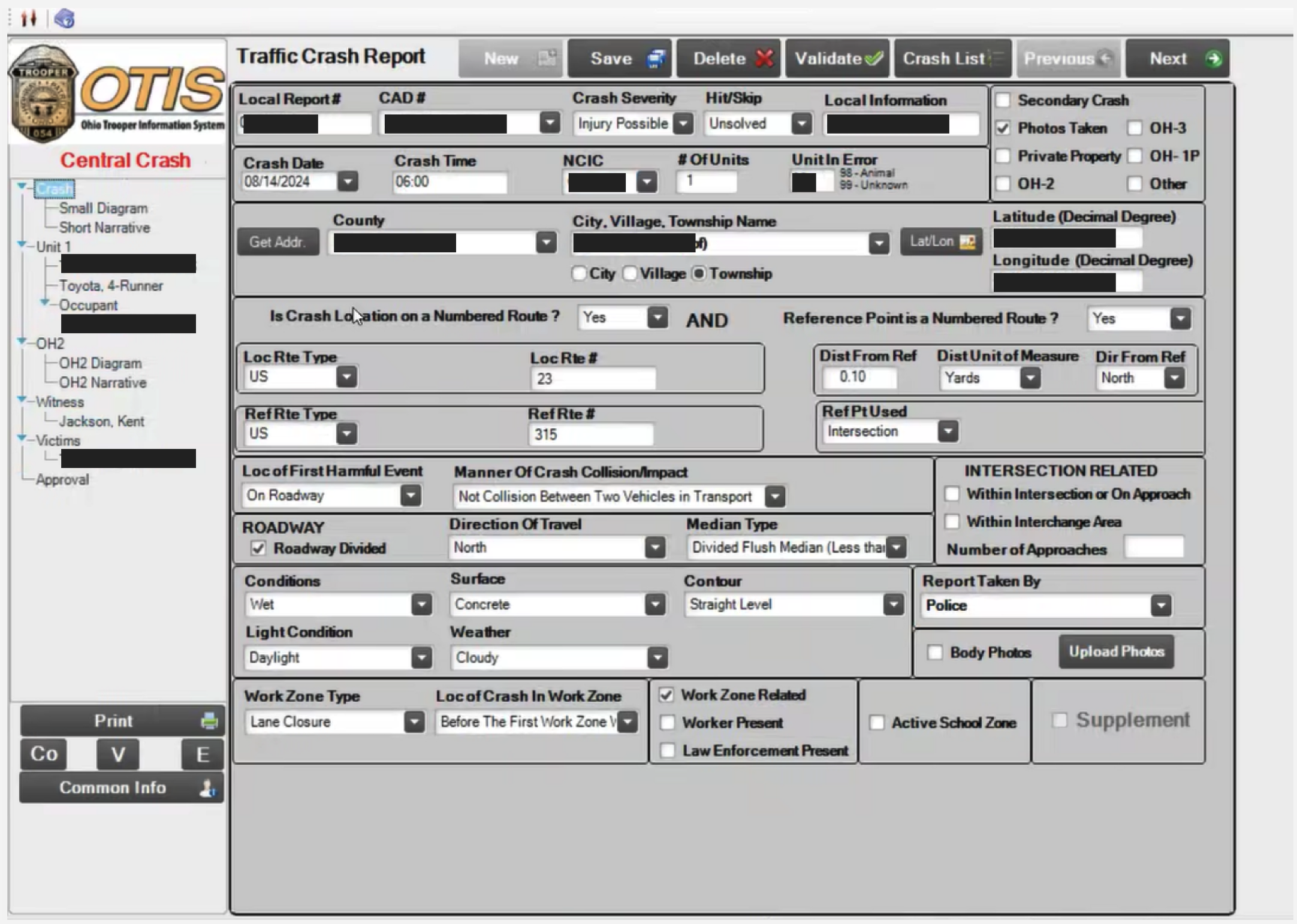
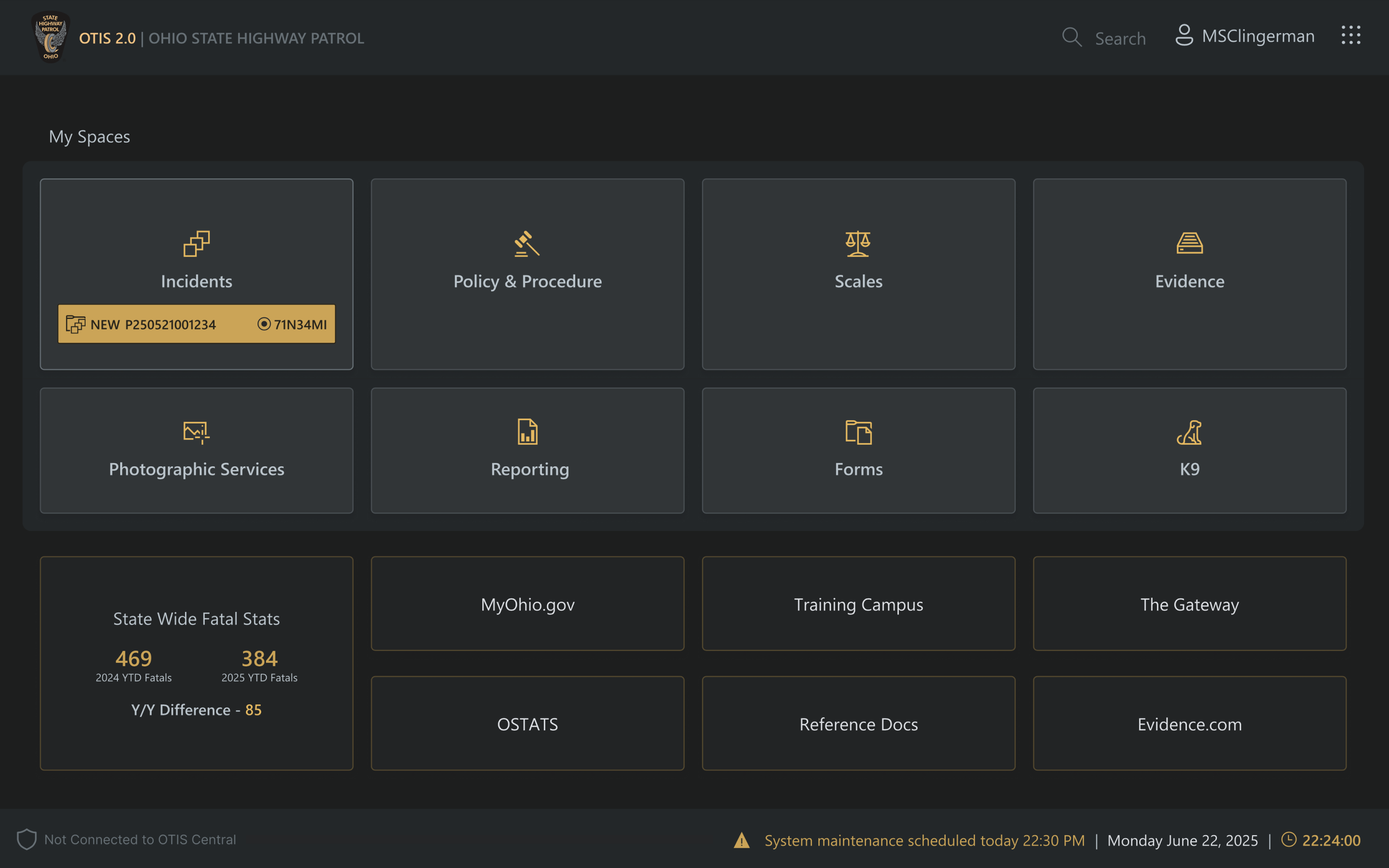
When vision and cognitive load stack up
Picture the trooper the legacy form was used by: over 50 and wearing reading glasses, standing at the roadside in sunlight, one hand on a tablet, watching traffic and the driver while the radio cuts in. Any one of those is manageable. Together they compound, and a form that demands legal codes, retyped details and a steady hand turns into errors, lost work and drafts typed in Word instead.
Pilot targets: 20-30% fewer form errors and 25-35% faster to the first citation.
The idea
Most digital products are designed by people with sharp eyes, steady hands and new screens, then used by people with none of those. My research with older adults showed how quickly small design choices become barriers: pale text, color-only signals and tiny targets. Accessibility guidelines describe the problem in rules. This experiment lets you feel it, on a real site, in a few seconds.
What each simulation shows
- Blurred vision and cataracts erase fine detail and contrast. Thin type, light weights and small icons fail first.
- Low contrast sensitivity makes pale gray text vanish, even for people whose eye exams look normal.
- Color vision deficiencies collapse reds, greens and blues. Any status, chart or error shown only by color disappears.
- Hand tremor turns small, close-together targets into misses. Clicks land where the pointer shakes to.
- Roadside stacks sunlight glare and reading-glasses blur with a dispatch radio that keeps interrupting, the combined vision and attention load the OTIS 2.0 redesign was built around.
What I design for
Pair every color with a word or a symbol. Keep body text at real contrast and readable sizes, and let it scale. Make targets large and well spaced, and make mistakes easy to undo. These are the same principles I wrote about in UX Design Principles for Seniors and Older Adults, and the fixed card above follows them.
How it works
The Lens runs in the browser on every page of this site. Vision simulations are filters applied to the page: blur, contrast and sepia for cataracts, and color matrices for the three color vision deficiencies. The tremor simulation shakes a stand-in pointer at 4 to 9 hertz, the range of common tremors, and redirects each click to wherever the pointer has shaken to. All of these are approximations meant for empathy and design review, not a medical model.